
Tools used: Illustrator, Photoshop, XD, pen and paper / Project's Year: 2019
Introduction
The projects goal was to present a company, and create a mobile app to reflect the brand. My scope of work was to create hi-fidelity mockups and show a final working prototype of the app.
What is Trainee?
Trainee is a mobile application that is intended for students and companies. Its main goal is to serve as an easy way for students to find job or trainee program, while for the companies to post jobs and help them connect with potential interns.
Product offerings
News Feed
A feed board filled with posts from companies as well as users. In that part of the app there will be various job opportunities for interns.
Job Search
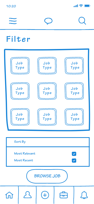
In the app students will have the ability to search for jobs that match their desire for growth and new skills. There will be a filter giving them many options to choose from.
Chat Functionality
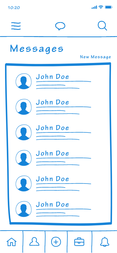
Users will be able to easily correspond with each other regarding potential job offerings via the chat functionality, giving a social media experience to the app.

Problems
Usability
In is important to identify groups of potential users, as well as their demand on usability and accessibility matters.
Hiring Process
Having in mind that most summer jobs last only few months, the app should serve as a fast way for recruiters and students to get connected and start working together in timely manner.
Opportunity Inflated
The app should be very easy to navigate, giving many opportunities to students to find the perfect summer job, so the user interface should carefully avoid complex paths.
Research
I moderated in-depth interviews with students and employers to gain an understanding of their needs.
In order to understand the pain points of the product, and the opportunities for new media touch points in the customer’s daily life, I created a user journey from my observational and secondary research. Exploring similar apps was a key point of the research giving general idea of what is working and what should not be considered in this product. During this process I was able to identity the potential strengths of our application.
In order to understand the pain points of the product, and the opportunities for new media touch points in the customer’s daily life, I created a user journey from my observational and secondary research. Exploring similar apps was a key point of the research giving general idea of what is working and what should not be considered in this product. During this process I was able to identity the potential strengths of our application.
Expert interviews
I needed to understand what obstacles the students face on a day-to-day basis, and what issues they perceive to be systemic. For that reason I interviewed a couple of students and employers, who could describe what would be beneficial for them.
From this I learned that a major issue is the sheer amount of time spent on browsing for the right opportunity, while for employers such problems would be frustrations, caused by usability, which were slowing them down during the hiring process.
From this I learned that a major issue is the sheer amount of time spent on browsing for the right opportunity, while for employers such problems would be frustrations, caused by usability, which were slowing them down during the hiring process.
Cultural probes
I developed several digital cultural probes out into the wild in order to investigate the quantity and quality of qualitative data that was collected on users. I released our probes to 7 different people of diverse backgrounds, nations and age groups. It was important to understand the daily activities, interests, as well as career vision of our users.
Audit
I performed an extensive audit of other job search apps. Primary, I focused my audit on the user flows of those applications as well as functionality offered. This was helpful in identifying what features existed and why. I then used sticky notes to write down the features I had identified, and performed a feature combination session to help identify untapped market space.
Competitive analysis
After completing a competitive analysis, I realized that not many job searching companies focus on primary intern openings as well as summer jobs with short contracts.
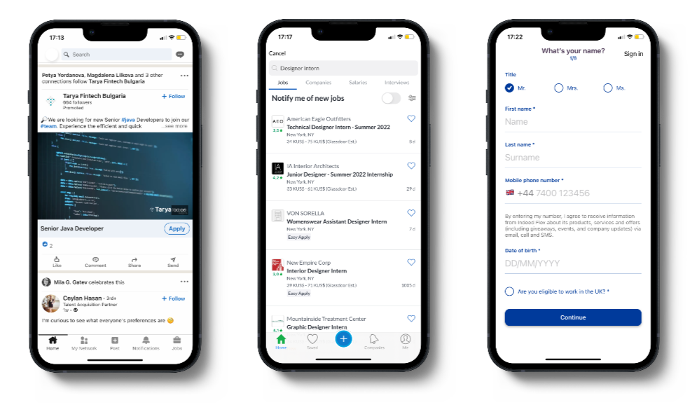
LinkedIn App
LinkedIn is probably the most famous platform for job searching, recruitment and connecting with other users. However, this app isn’t focusing only on interns and summer jobs and the interface is quite formal.
Glassdoor App
Glassdoor has a powerful job search mechanism, which is quite unique giving you options to work for employers from around the world. It has a modern look, which is close to our apps goal, because it is more attractive for younger people.
Indeed App
Indeed is another job listing app, which has gained popularity mostly in US and UK. One major setback is that the app focuses only users from those two countries. Its design is also modern and may appear attractive for our target group.
Painpoints
From my research I found that most job listing apps don’t focus on specific groups of people, so the end-to-end experience, when using them is practically the same. From my research on potential users I noticed that there is a crave for job listings apps to become “smarter”.
Users can also get frustrated by having to engage with third-party application forms for various jobs they apply, which is the case with the other job listing apps.
Users can also get frustrated by having to engage with third-party application forms for various jobs they apply, which is the case with the other job listing apps.
Main Objective
I needed to create something that should be of help for students and employers to get connected as easily as possible. The end-to-end process should be handled only within the app and should be fast, so students can avoid spending too much of their available time looking for a job during their summer brake.
Ideation
Sketching
Throughout this project, my sketchbook proved invaluable time and time again. Being able to quickly iterate with my sketchbook, I could create some basic wireframes of the future app with the stroke of a pen.
Doing this, I managed to get instant feedback, which allowed me to iterate on concepts rapidly.
Doing this, I managed to get instant feedback, which allowed me to iterate on concepts rapidly.
Affinity mapping
Throughout my ideation process, I used sticky notes repeatedly to organize my thoughts. One of the reason to use them was for mapping potential user flows, customer journey maps, as well as competitive analysis.
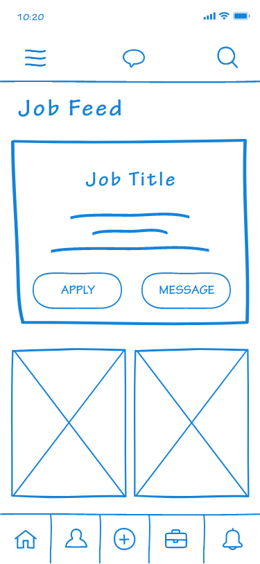
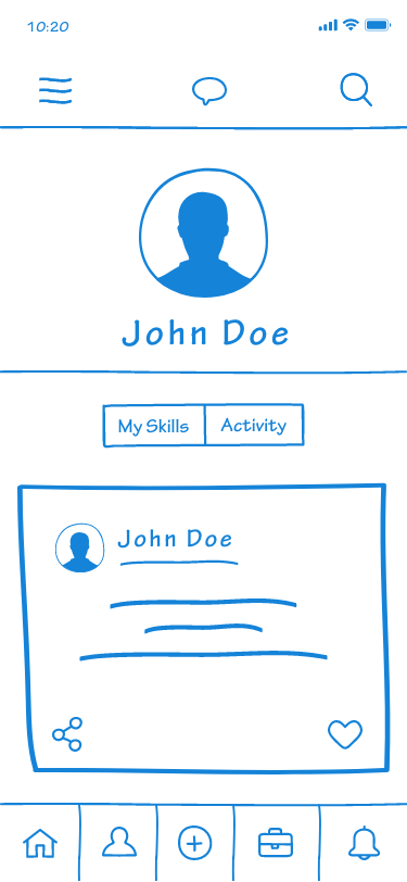
Wireframes & Low-fi Prototype
I wanted to allow students and employers to communicate with greater frequency. I also wanted my solution to be flexible and adaptable to fit the users widely variant needs.
In this process I took inspiration from other familiar interfaces such as LinkedIn. In my wireframes there are four key windows that are of great importance for the users: “News Feed”, “Find a Job”, “Messaging Box” and “User Profile”.
Those windows should be simplified to the greatest extend, so the overall flow to be quick and well-known to the users. The app should avoid having many hotspots on a single screen, in order the user’s journey map to be as straightforward as possible.
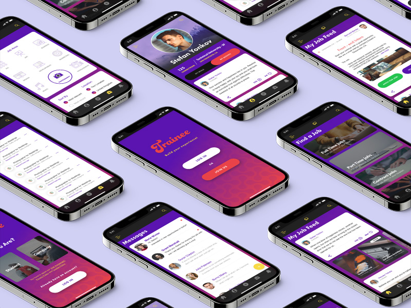
Mockups & Hi-fi Prototype
After carefully reviewing with potential users the wireframes and low-fidelity prototype, it was time to take their feedback into concern. Next, I had to decide what was worth considering & updating from those insights and what was not. During that stage it was important to note accessibility, equity and equality potential issues as well as usability.
Key features, which were decided upon the received feedback to be with the most value for the users were the fast the straightforward job search functionality, the messaging option, the user friendly news feed, which shows user posts, as well as various job opportunities, which depending on a special algorithm filters what to show in the future and what not (if user declines more than once I certain job area, then it won’t show relevant job posts in the future) and user profile functionality.
Key features, which were decided upon the received feedback to be with the most value for the users were the fast the straightforward job search functionality, the messaging option, the user friendly news feed, which shows user posts, as well as various job opportunities, which depending on a special algorithm filters what to show in the future and what not (if user declines more than once I certain job area, then it won’t show relevant job posts in the future) and user profile functionality.
Accessibility & Final Touches
One last matter that was of great importance to be carefully reviewed once again was the app’s accessibility. We decided to integrate voice commands for users, who have struggles using keyboard.
Another important feature that was taken into account was the colour scheme. Because the app was designed mainly for younger users it was important to use vivid colours, but this brought a potential issue with contrasts and colour differentiation. A solution was to create a heat map, which pinpointed which areas in the design needed a more eye-catching effect concerning the app’s intentions. In addition, another key change in order to make good separation between key elements and more secondary ones was to increase the spacing and change the font size and weight.
As a final touch it was decided to implement a “Choose a language” functionality upon the design, having in mind the wider range of users from around the world the app was intended for.
Start a Project
Excited to get started? Click the button below to schedule a free consultation with me, where we will discuss your project!
Free consultation